Context:
Segue is an editorial concept for a residential magazine aimed at creatives and young professionals, designed to explore layout, pacing, and visual rhythm across print.
Segue is an editorial concept for a residential magazine aimed at creatives and young professionals, designed to explore layout, pacing, and visual rhythm across print.
Approach:
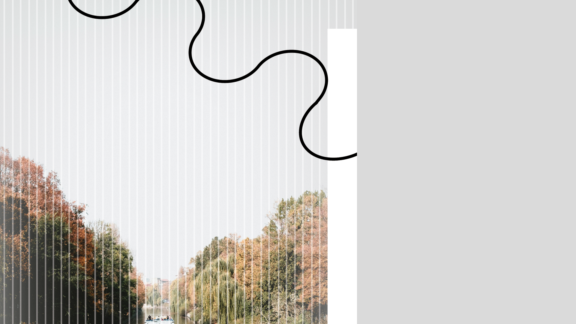
I focused on using grid structure and typographic contrast to guide hierarchy and pacing. This led to the introduction of organic line work to break the rigidity of the grid and create visual flow between sections. The layout system was designed to balance consistency with variation, allowing each spread to feel distinct while remaining cohesive.
I focused on using grid structure and typographic contrast to guide hierarchy and pacing. This led to the introduction of organic line work to break the rigidity of the grid and create visual flow between sections. The layout system was designed to balance consistency with variation, allowing each spread to feel distinct while remaining cohesive.
Challenge:
The challenge was to create a layout system that felt engaging and dynamic while maintaining clarity and readability across multiple spreads.
Outcome:
The result is a set of editorial spreads that feel structured yet expressive, with a clear hierarchy and a rhythm that supports both readability and visual interest.
The challenge was to create a layout system that felt engaging and dynamic while maintaining clarity and readability across multiple spreads.
Outcome:
The result is a set of editorial spreads that feel structured yet expressive, with a clear hierarchy and a rhythm that supports both readability and visual interest.
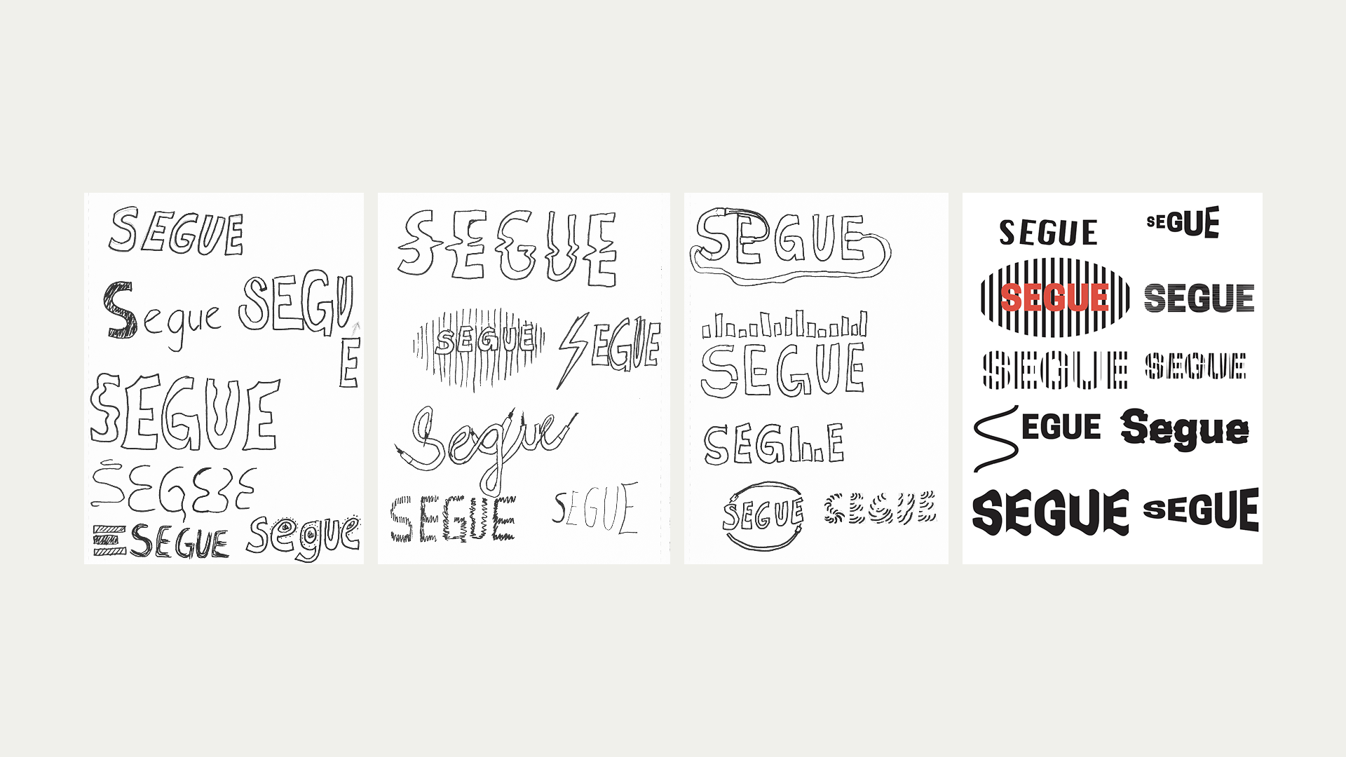
Logo Exploration for Segue
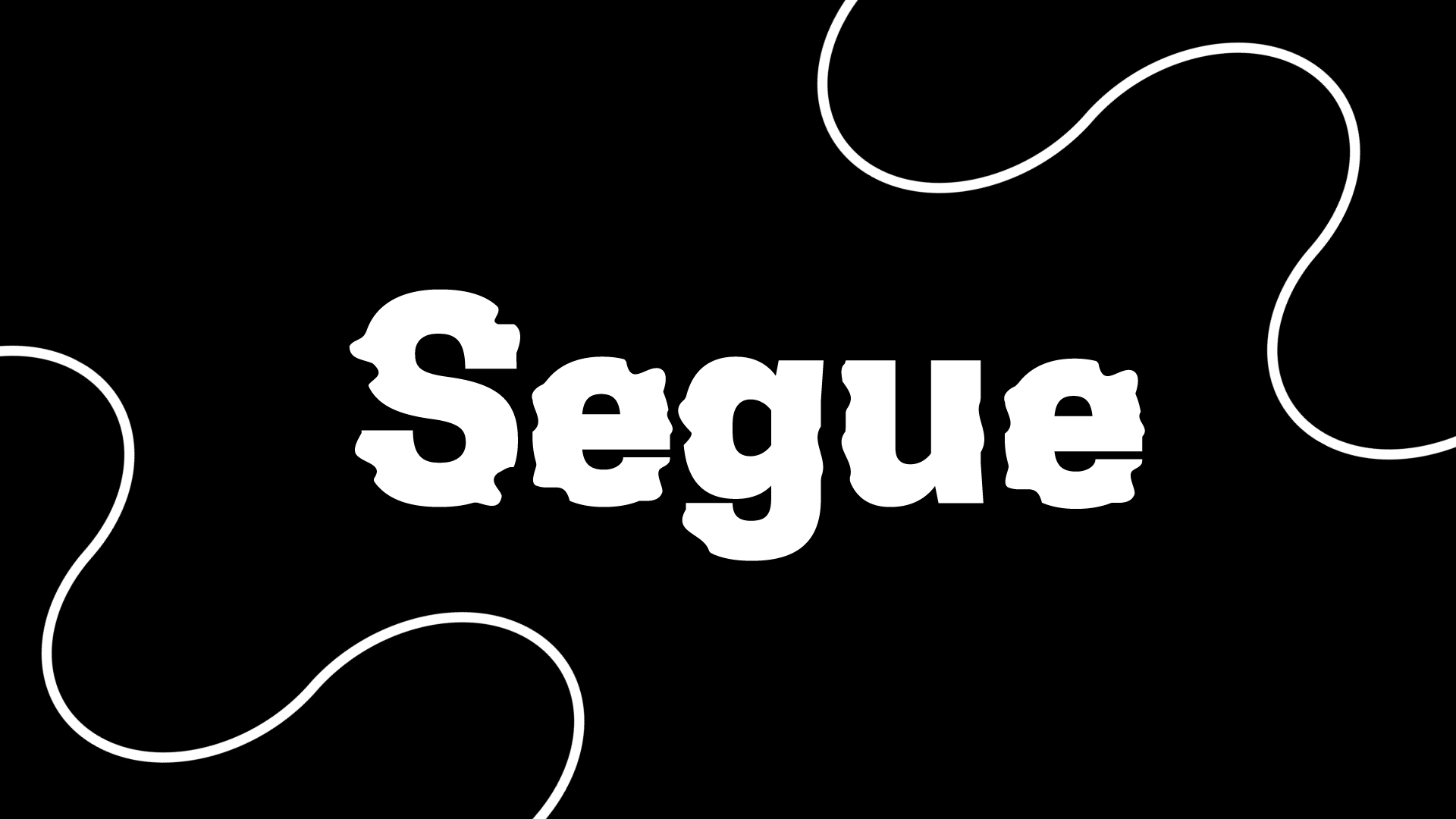
Final Logo for Segue
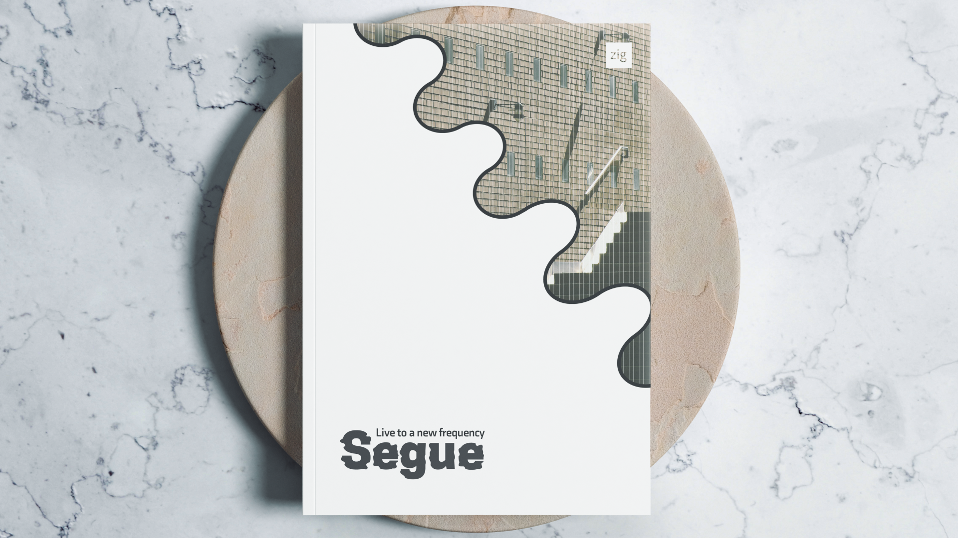
Segue - Front Cover
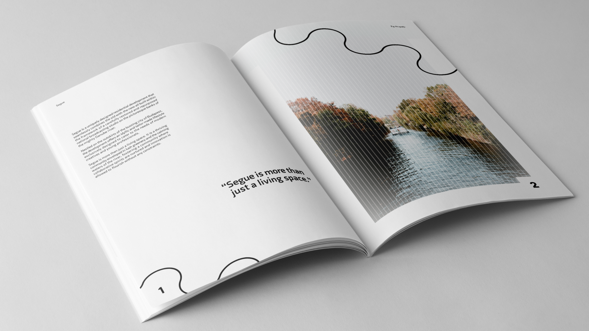
Segue - Inner Spreads Pages 1 - 2
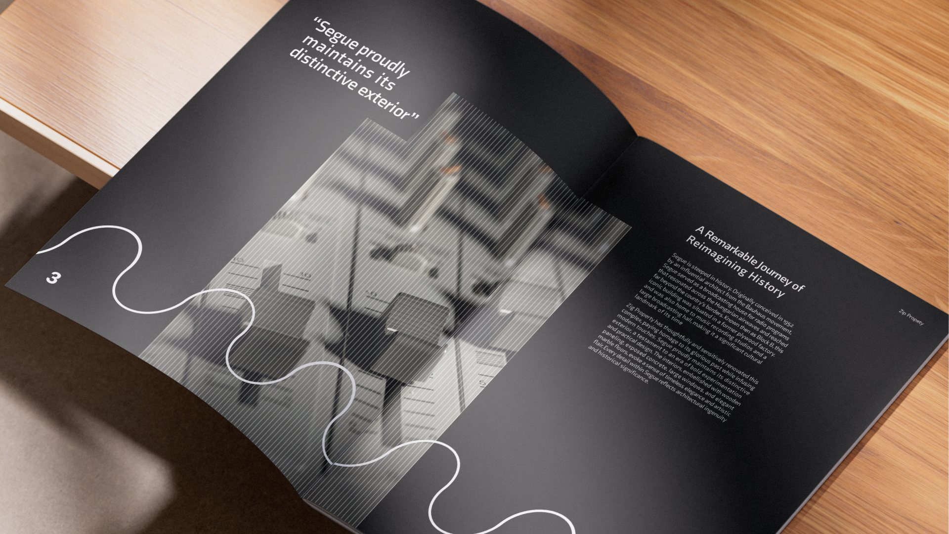
Segue - Pages 3 - 4
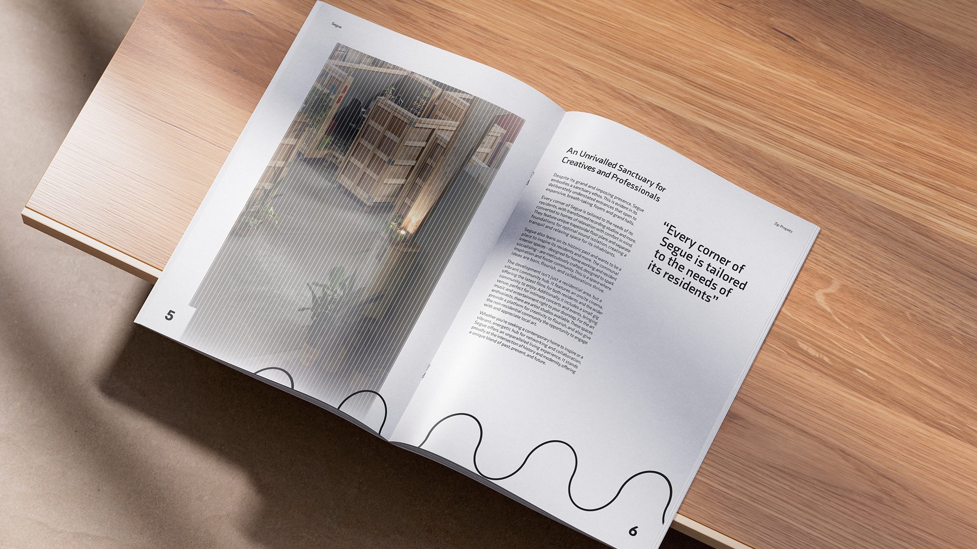
Segue - Pages 5 - 6